The Defense Budget Illustrated [GRAPHS]
Neither the universe, nor the Defense budget are infinite. However, both are so vast that they are difficult to visualize.
The Business Insider has been posting graphs of the Defense budget in an effort to help us grasp a just how big it really is. Based on information from the Stockholm International Peace Research Institute (SIPRI), the one below compares US spending with the rest of the world.
Please note that US Defense spending is larger than all the other countries on the chart combined.
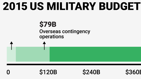
In a separate article, the Business Insider posted more detailed graphics:
Operations & Maintenance as well as personnel still eat up the lion’s share of the budget, while procurement (the part that typically vendors fixate on) remains a relatively small $90.4 billion.
As befits the administration’s “Pacific Tilt,” the Navy and Air Force get more money than the land-based Army.
Please note the amount of funding that goes to the Overseas Contingency Operations (OCO), but really isn’t formally part of the Defense budget. As the graphs from the Council of Foreign Relations (CFR) demonstrate, overseas troops and the OCO have been decreasing since an all-time of 2008.

BTW, the CFR website is Nirvana for graph freaks. They have a multitude of Defense-oriented graphs illustrating a variety of esoteric metrics, such as “Growth effects on US Military Spending, Share of Global Total.”
Note of caution: just because it is in a graph, doesn’t mean that you can completely trust it. Agendas do play a role and information can be slanted in a chart as easily as it can be in the written word.


